●
UX
Change
:
Project Details
Date
2023
Status
●
Completed
About the Client
CHANGE Coffee is a coffee brand built around the idea of change, mindful pauses, and the influence of coffee on a person’s inner state.
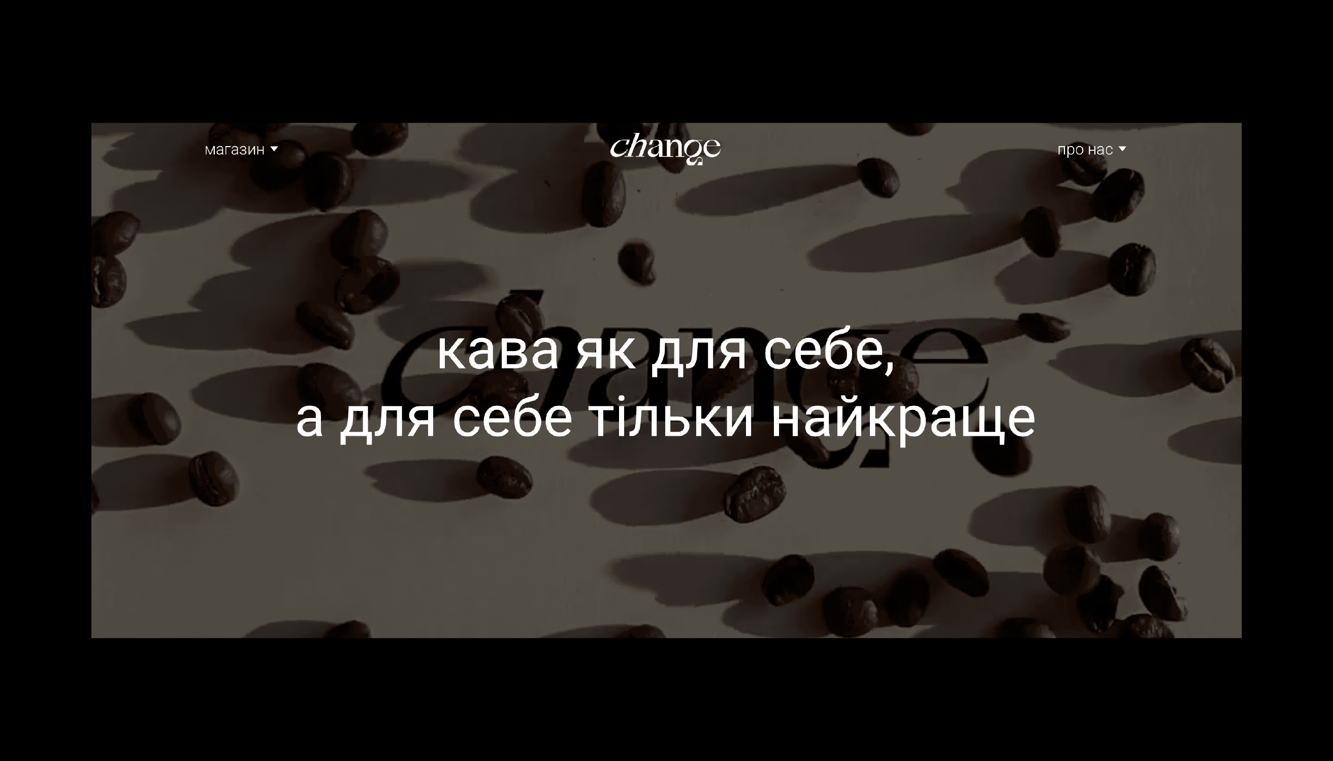
CHANGE talks about coffee not as a quick stimulant or habit, but as a moment — a segment of time in which focus, rhythm, and interaction with reality shift. The brand exists both in digital environments and physical touchpoints and requires an identity that works equally well in both spaces.
Challenge
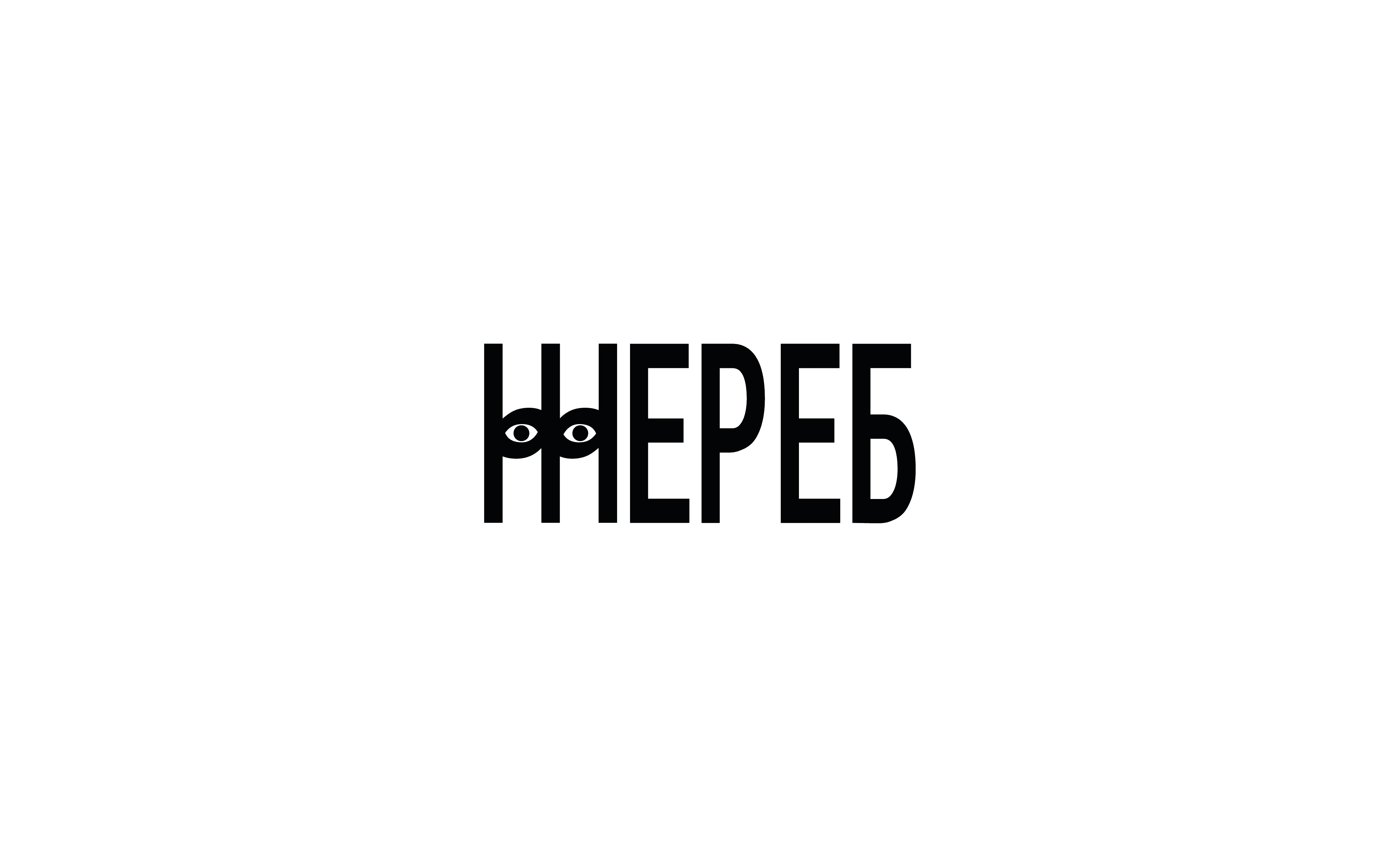
The main challenge was to create an identity that conveys the impact of coffee and the idea of change without complex metaphors or visual overload. It was important to avoid straightforward “coffee” imagery and clichés while maintaining emotional depth and recognisability. The identity needed to be calm, rhythmic, and conceptual — allowing the brand to speak about a person’s inner processes, not just the product.
Solution
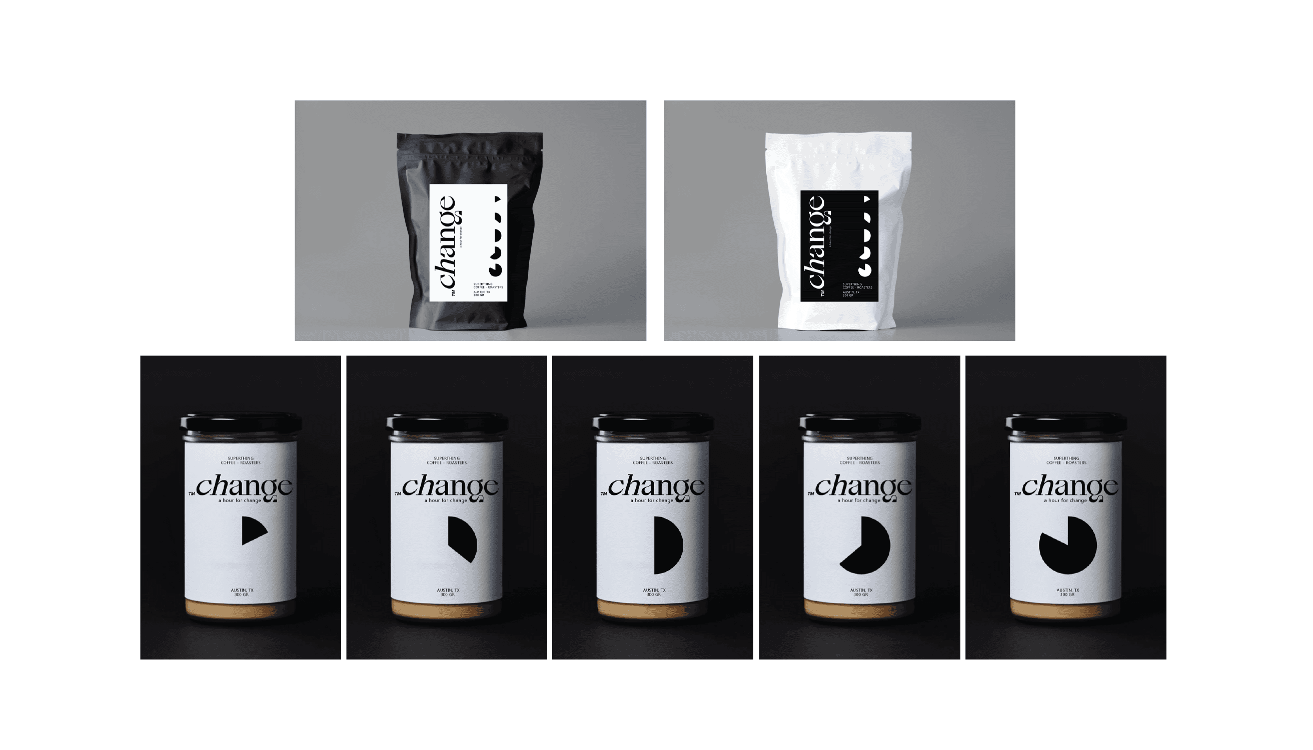
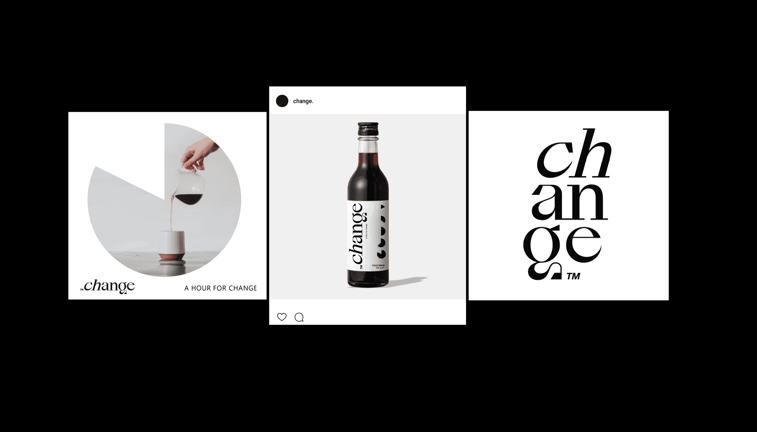
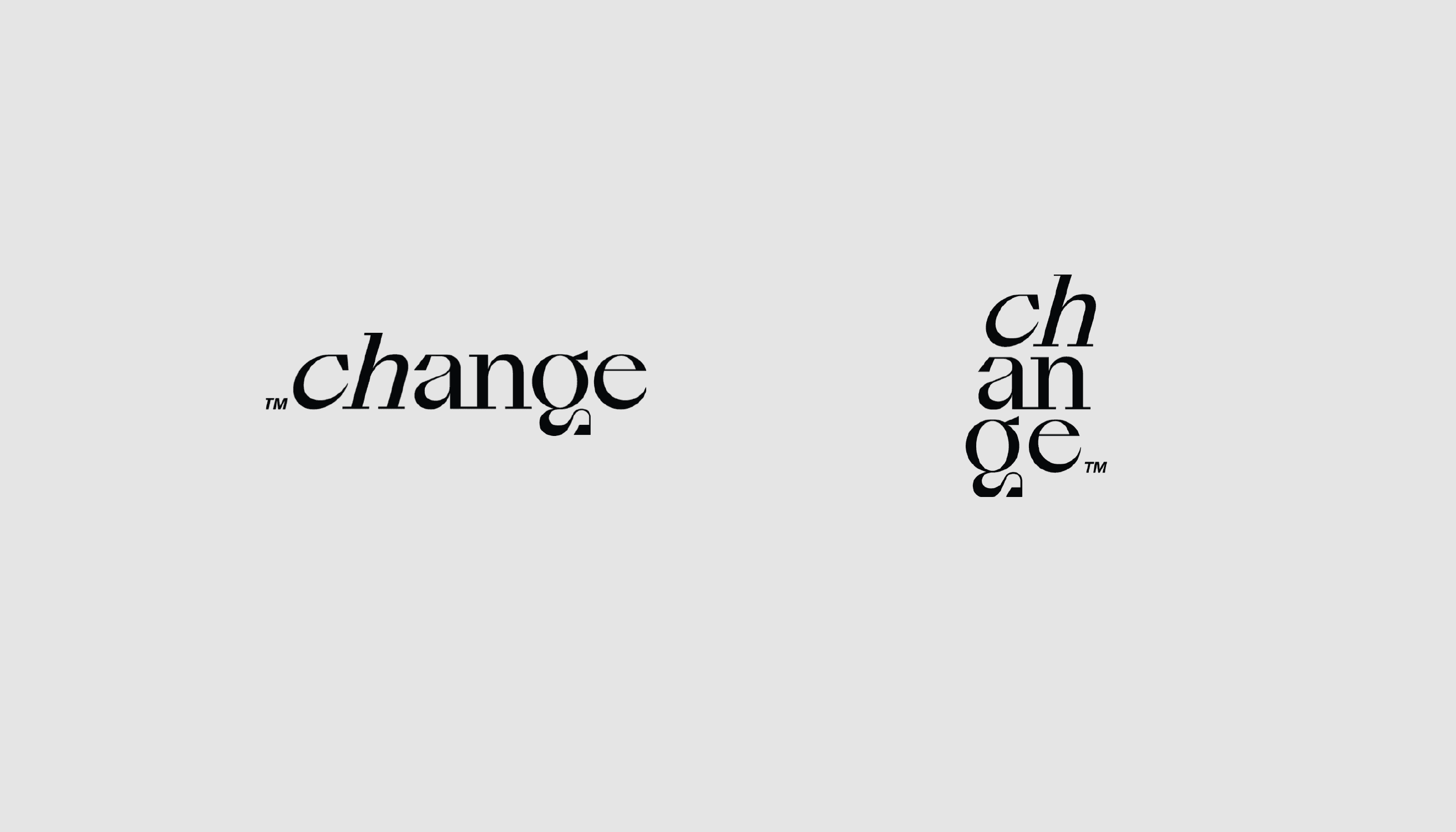
Time became the core symbol of the brand identity. The design is built around the idea of an hour — a time segment during which a cup of coffee influences a person’s state, focus, and inner rhythm. This motif directly reinforces the name CHANGE, presenting coffee not as an object but as a process and a moment of transformation.
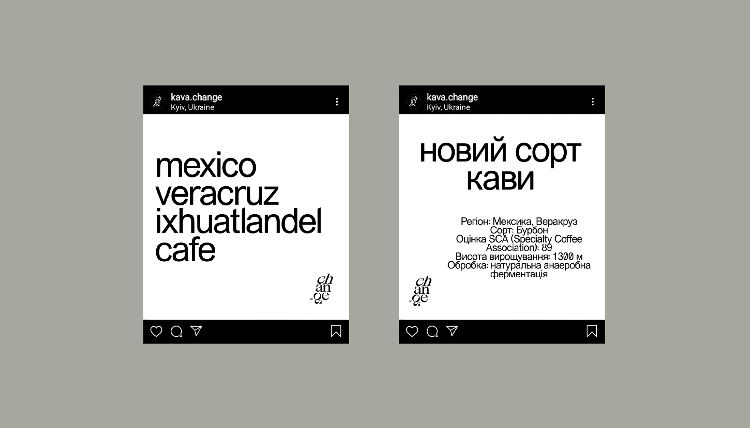
The identity is built on simple, repetitive forms and a clear typographic rhythm that function as a visual measure of time — calm, steady, and free of unnecessary decoration. A minimalist black-and-white system removes secondary elements and keeps the focus on the core idea. Sub-slogans such as Coffee hour or A hour for change are organically embedded into the system, reinforcing the narrative of pause, time for oneself, and conscious choice.
WHAT WE ACHIEVED
RESULTS
As a result, the brand received a cohesive and recognisable identity with a clear conceptual foundation. The visual system scales easily and adapts to packaging, digital channels, and communications without losing meaning or rhythm. The identity functions as a calm frame for the brand, emphasising the ideas of time, pause, and change, and allowing CHANGE to speak about coffee as an experience rather than just a product.
MATERIALS
Brand identity
Communication materials for social media
Packaging design
MEDIA