●
UX
Zhereb
:
Project Details
Date
2025
Status
●
Completed
About the Client
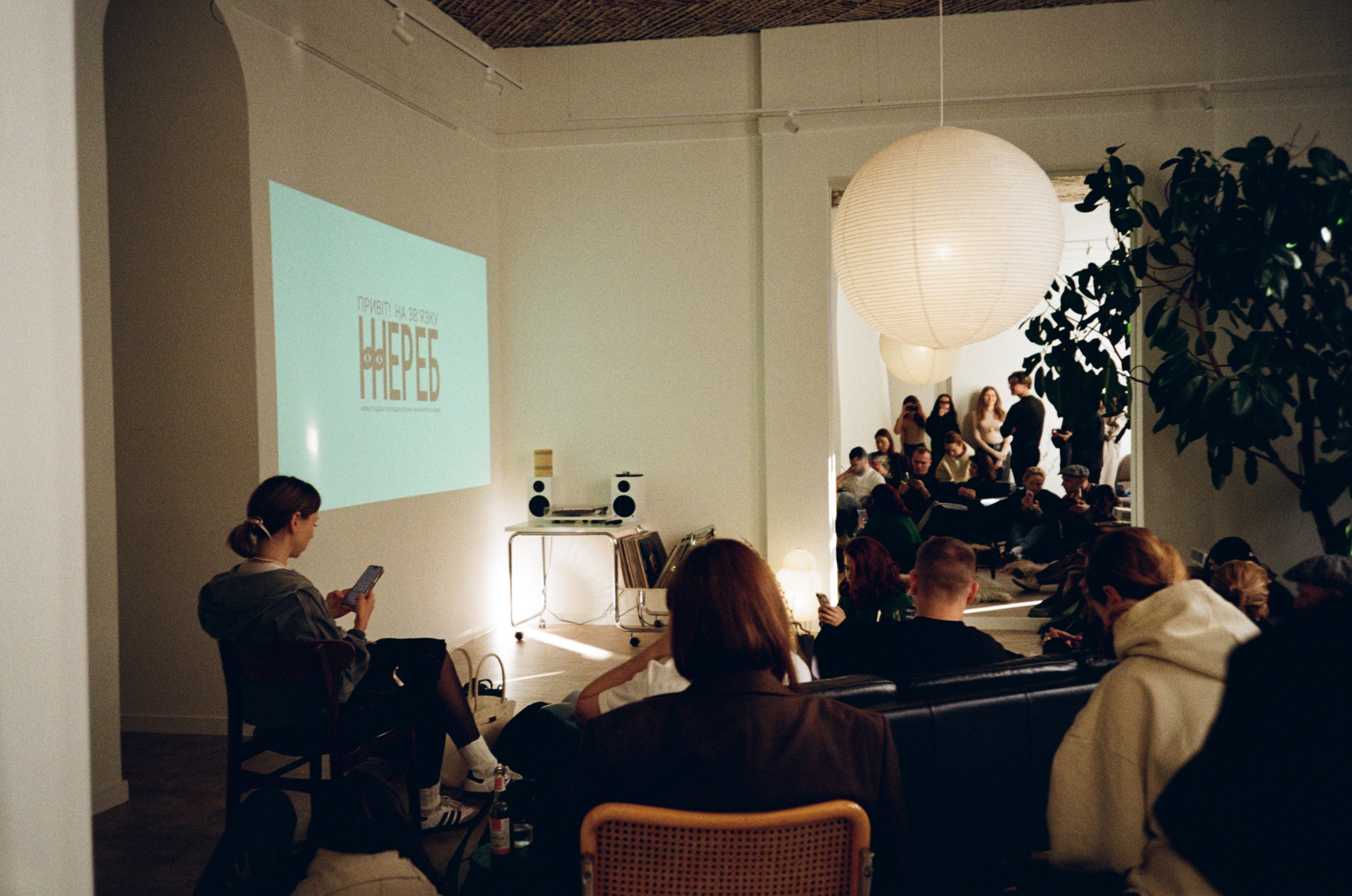
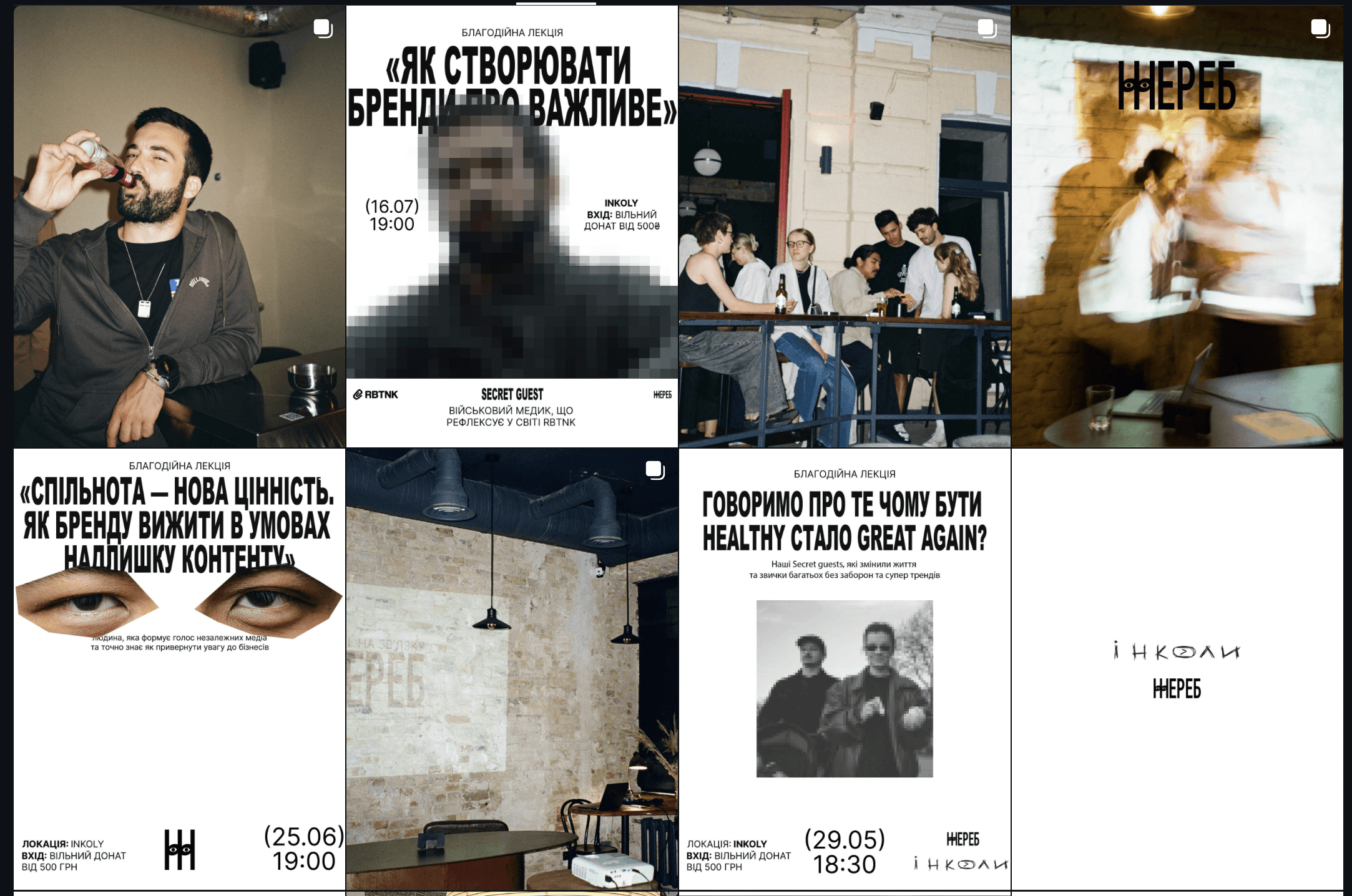
Zhereb is a long-term lecture initiative created by the Kinetika team as the project’s initiator and curator. The project emerged as a way to support the “Burevii” brigade while also serving as a space for open conversations within the community.
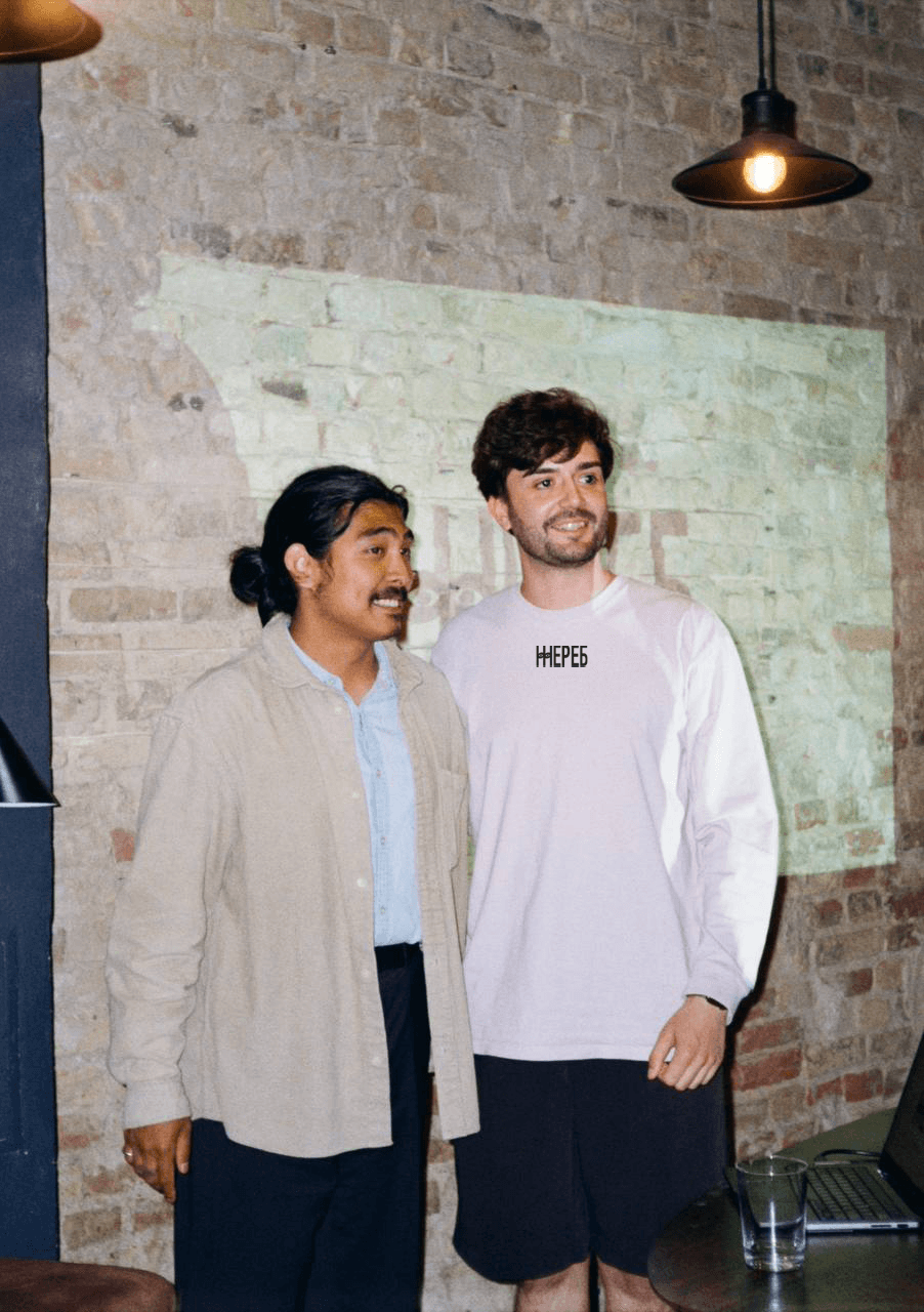
The lecture format follows a secret guest principle, where the speaker remains unknown until the event starts. This shifts focus from status to content and dialogue. Zhereb is not limited by themes, covering topics from journalism and war to business and self-reflection.
Challenge
The main challenge was to create a visual language for a lecture series that deliberately avoids focusing on personalities. The identity had to function in conditions of constantly changing topics and the secret guest format, without relying on names, faces, or personal brands. It was important to find a form of communication that would not impose emotion, create noise, or turn the event into a typical show, while still accurately conveying the project’s internal state — trust, attentiveness, and readiness to listen. The visual system needed to be recognizable yet restrained, memorable without overt demonstration, and perceived by the community as a shared, familiar space.
Solution
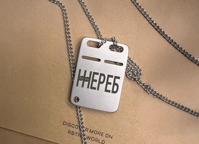
Zhereb’s visual system is built around a state of observation and listening — not as control, but as shared presence.
The key visual symbol became the eye — a symbol of seeing, being seen, and looking deeper than the surface. It functions as a metaphor for an attentive conversational partner in a safe space for dialogue.
The secret guest format is reinforced through design: the absence of emphasis on specific faces or names shifts attention to the topic and content. People come not “for someone,” but for the conversation, already prepared to listen.
The black-and-white palette intentionally removes emotional noise, leaving only what matters most — the idea, the topic, and human connection.
Typography is large, confident, and slightly rough — it doesn’t embellish or over-explain. It speaks directly, the same way this community does.
WHAT WE ACHIEVED
RESULTS
As a result, Zhereb received a cohesive and resilient visual system that organically supports the project’s idea and requires no explanation. The identity functions independently of specific topics or speakers, maintaining focus on content and the conversation itself. It creates a sense of internal cohesion and trust, forming a recognizable space for dialogue without visual pressure or unnecessary accents.
MATERIALS
Brand identity
Design support
MEDIA